Long Form
A Tale Of 2 Iron Man Posters
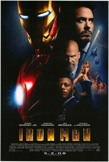
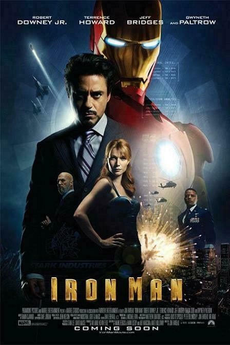
Today Paramount unveiled the final Iron Man theatrical posters for both the US and International markets. The part that’s bizarre is that they’re both very similar, yet have slight differences.
Here’s the US Poster First…
Then you have the international version…
Now, while both suffer from floating head syndrome, I overall find that the US poster has a far better layout. What’s bizarre is why they chose the different layouts, and why certain elements aren’t in both…why does the US version have no helicopters? Why are the bodies more noticeable in the international version? What does that say about our cultures?
Which do you like? Personally, I dig the design of the US one more, and look forward to it being a DVD cover.
Friday March 7, 2008

