Long Form
DC Comics Unveils Yet Another New Logo
Stop me if you’ve heard this before:
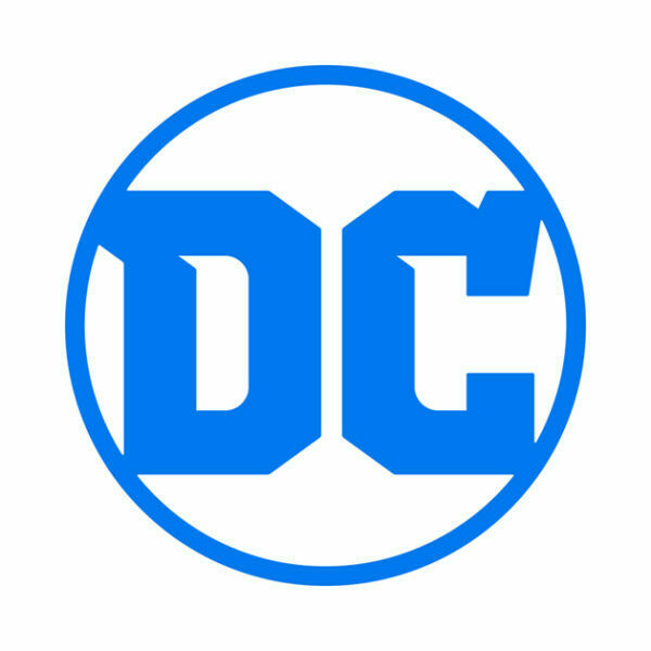
DC Comics is relaunching all of their titles, and to celebrate it, the company is getting a new logo and branding.
Yes. This is pretty much exactly what they did in 2011 with “The New 52”, matched in 2012 with their current, odd, peeled-back logo.
Guess what! Everything old is new again!
Not only is their universe getting a relaunc…sorry, a “Rebirth” this month, but yes, a new logo is coming as well!
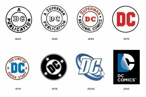
Making for DC’s 3rd logo since 2005, looking at this timeline of past logos, the new one is actually kind of a throwback, very similar to the 1972 variant:
That said - this feels like a weird re-branding move, especially when they have / have had two great logos already available, in the 1976 and 2005 variants.
Personally, my mind’s eye always thinks of the 1976 version, when I think of DC. Â I don’t think this new logo is “bad”, it just feels unnecessary, as if corporately they’re trying to say “THOSE OTHER TIMES WE RELAUNCHED? FEH! THIS ONE IS FOR REAL!”
What say you, dear reader?
The new DC Comics logo will first be seen on the cover of DC Comics: Rebirth #1, due to hit shelves on May 25, 2016.
Tuesday May 17, 2016

